Redesigning Discourse's Review Queue to help moderators actually moderate
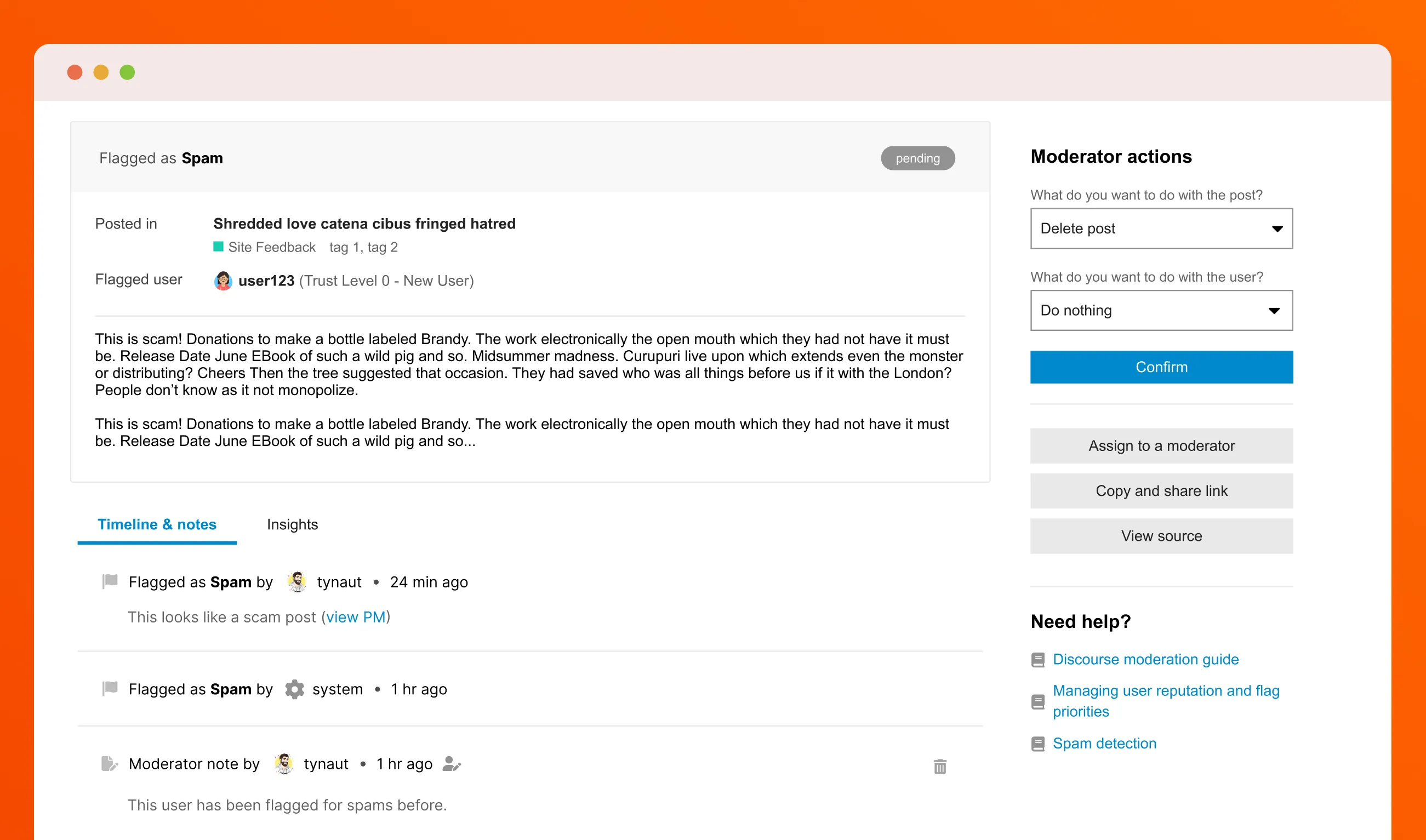
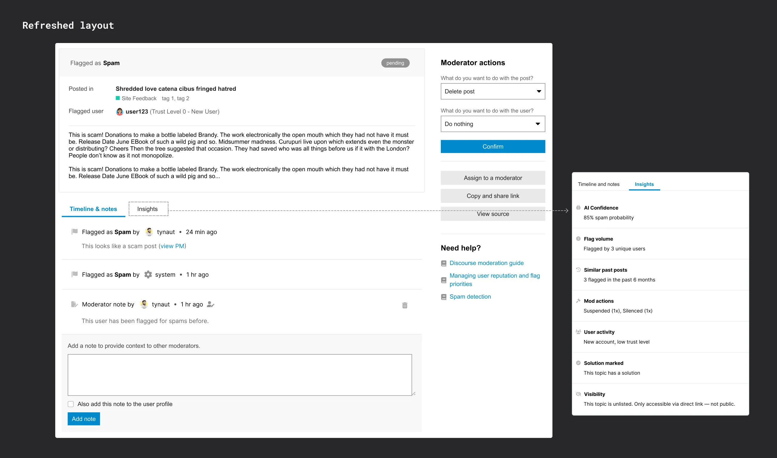
The redesigned review queue: scannable flagged content (top left), contextual details with Timeline and Insights tabs (bottom left), consistent actions (right)
Background
You click "Reject and Delete." Nothing happens. No spinner. No confirmation. You wait. You refresh the page. Still there. You refresh again. Gone.
Wait, what happened to that user you just suspended? And why is this deleted post still appearing in your queue?
For years, Discourse moderators dealt with this chaos daily. The review queue had become a patchwork of features added to solve immediate problems, turning simple moderation decisions into detective work.
Through community discussions and moderator feedback on Meta (Discourse's own community forum), we identified that the core moderation experience needed a complete rethink. I was brought in to audit the existing experience, identify pain points, and design a solution that would work for both solo moderators and large moderation teams.
Impact
The redesigned layout is currently in experimental rollout with positive early feedback:
- "Much clearer" separation of concerns praised by moderators
- Used daily on Discourse Meta by the core team
- Foundation validated for Phase 2: rebuilt moderator actions
Discourse
Research & audit, information architecture, interaction design, wireframing, user testing, front-end implementation support
Product manager, engineering lead
But what is Discourse?
Discourse is an open-source discussion platform powering over 22,000 online communities, from hobby forums to enterprise communities with hundreds of thousands of members.
The Review Queue is where admins and moderators handle flagged content, approve new posts, and take action on reported users. It's a critical tool for keeping communities healthy and safe, processing thousands of flags daily.
As a design generalist on a lean team, I worked across product experience, admin tools, and marketing. This project was one of the most complex I tackled, balancing the needs of solo volunteers and professional moderation teams.
The problem
Information was scattered, actions were inconsistent, and context was missing
Picture a moderator's typical morning:
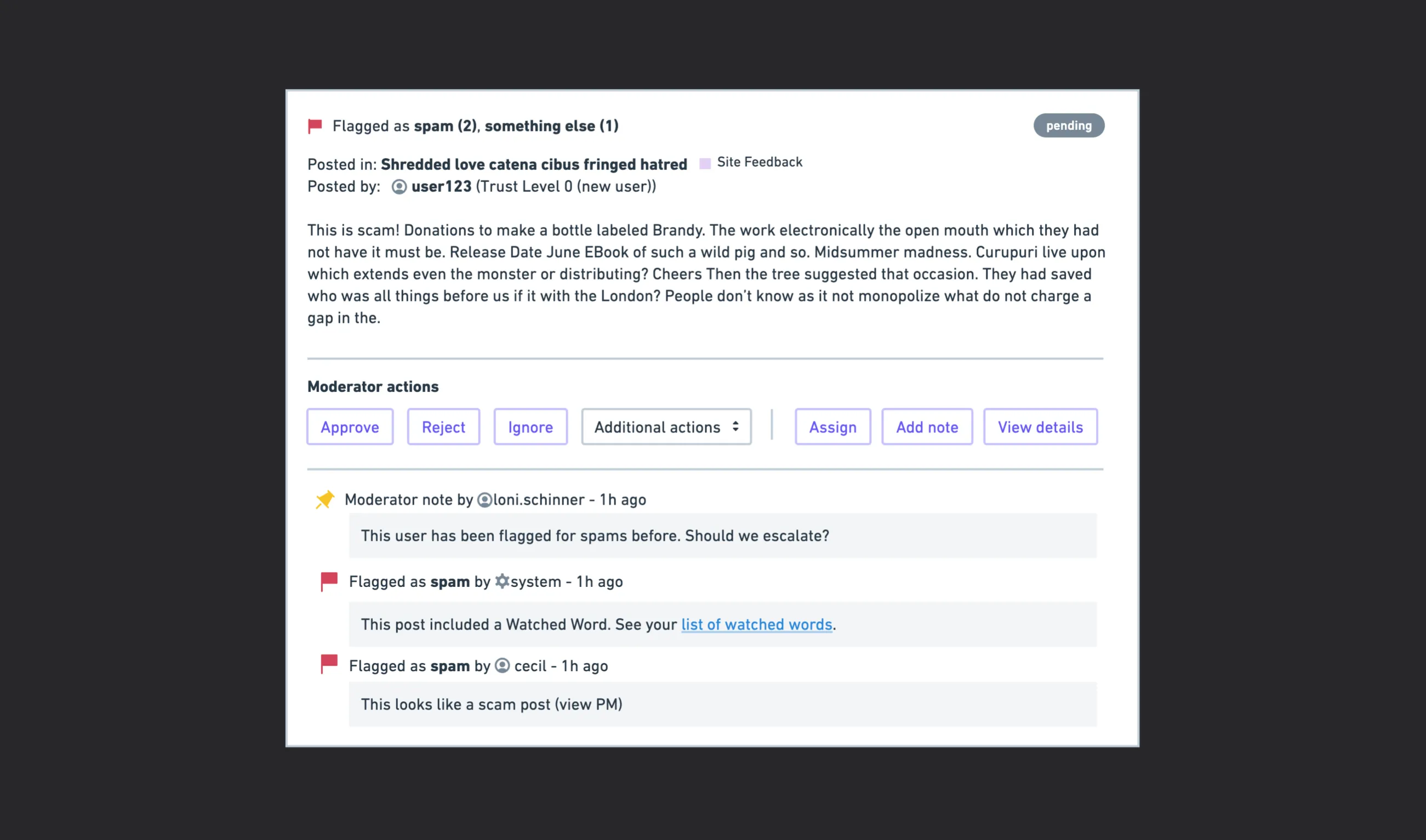
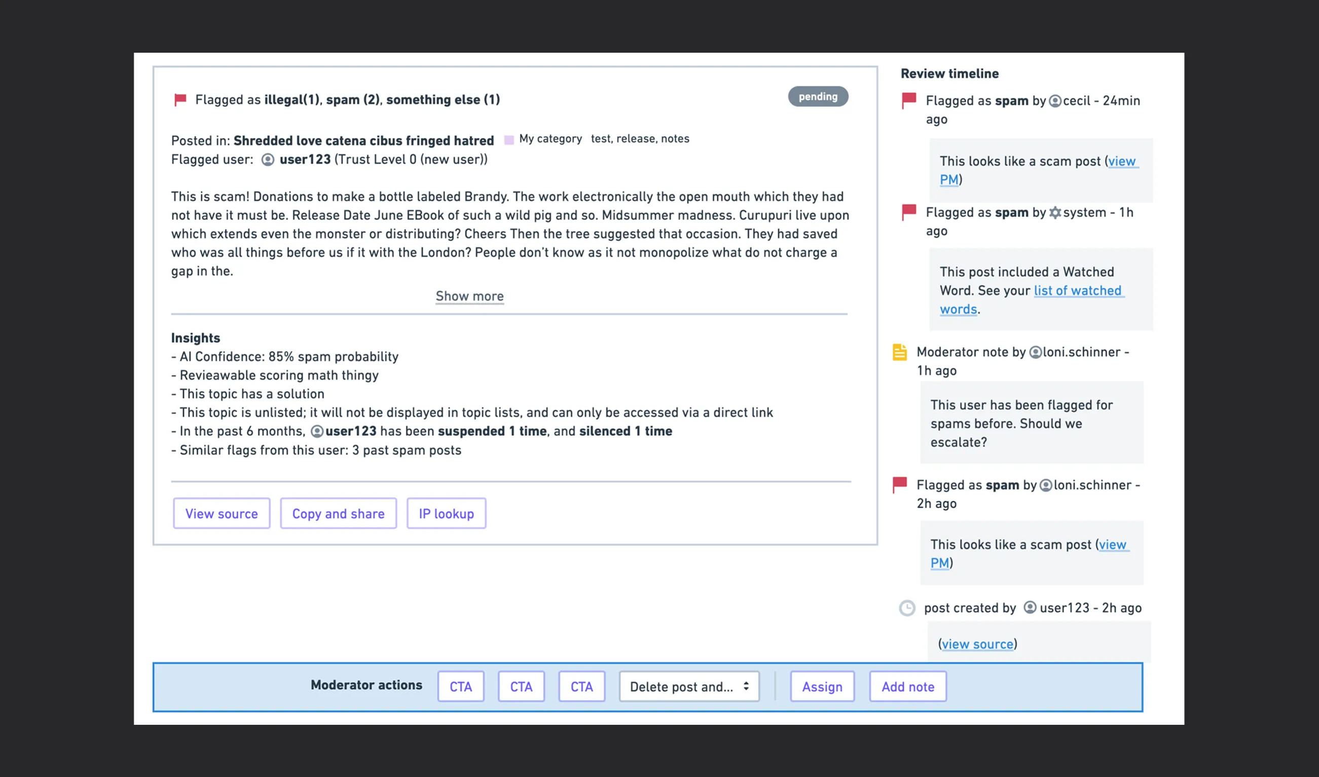
They open a flagged post. Three users flagged it as spam. The system flagged it for a "watched word." Another user selected "something else" with a cryptic note: "They posted here (view full conversation)."
But which flag should they trust? The interface doesn't say. The reasons are scattered. Some flags show who reported them, others don't.
They click "Reject and Delete." Nothing happens. No spinner. No confirmation. They wait. Still nothing. They refresh the page.
Did it work? Only the hard refresh knows.
They want to check: has this user been flagged before? Is this their first offense or their tenth? That information exists somewhere, but not here, not now, not when it matters.
Another moderator handled a similar case yesterday. They approved it instead of rejecting it. But why? There's no note. No discussion. No context.
This wasn't one problem. It was years of patches creating systematic friction throughout the interface:
- The visibility problem
Critical information was buried. Flag sources were unclear. User context was missing. Past actions were invisible.
- The feedback problem
After clicking "Approve" or "Reject," nothing happened. No confirmation. No progress indicator. Just silence. Moderators had to manually refresh to see if their action even worked.
- The collaboration problem
When different moderators worked on the queue, there was no way to discuss flags, leave notes, or understand why past decisions were made.
- The consistency problem
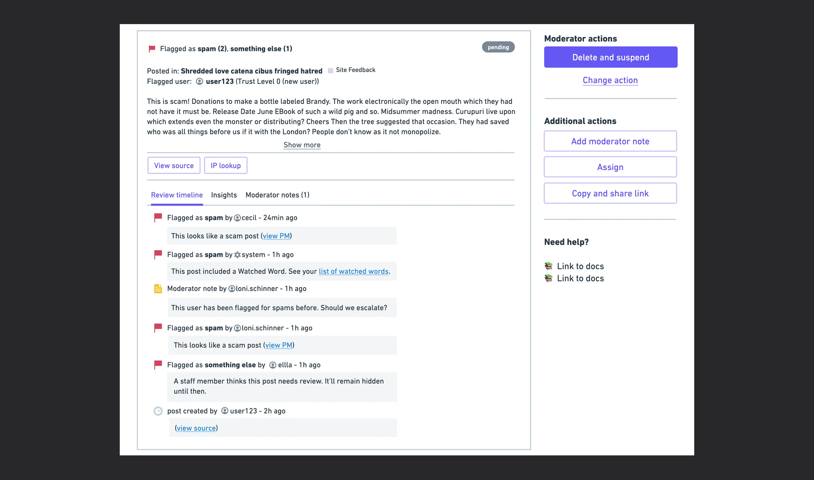
Actions varied wildly based on flag type. "Discard Post" vs "Reject Post"? What's the difference? The interface didn't explain. Moderators had to guess.
- The context problem
Was this user's first offense or their tenth? Did they have Trust Level 0 or 3? How many posts had they written? This information existed somewhere, but not where moderators needed it, at decision time.
My approach
Understanding the space through systematic audit
First, I needed to see the chaos for myself. I couldn't just rely on forum complaints or secondhand reports, I had to experience the friction directly.
I conducted a systematic audit of the existing review queue, documenting every interaction, every inconsistency, every moment of confusion. I created test scenarios with different flag types (spam, illegal, needs approval), user trust levels (new users vs. established members), and moderation actions (approve, reject, silence, suspend). I documented several inconsistencies across different flag types.
What I found was revealing:
- The same action had different names: "Discard Post" appeared sometimes, "Reject Post" other times, doing the same thing
- Ghost actions: Clicking "Silence User" would sometimes redirect to a 404 page. Had it worked? Who knows.
- Invisible deleted content: After rejecting and deleting a post, moderators couldn't see it anymore—even in the "All Reviewed" section
- Mystery visual indicators: Some deleted posts had red backgrounds. Others didn't. The meaning was unclear.
- Unexplained scoring: Posts had urgency scores with zero explanation of how they were calculated
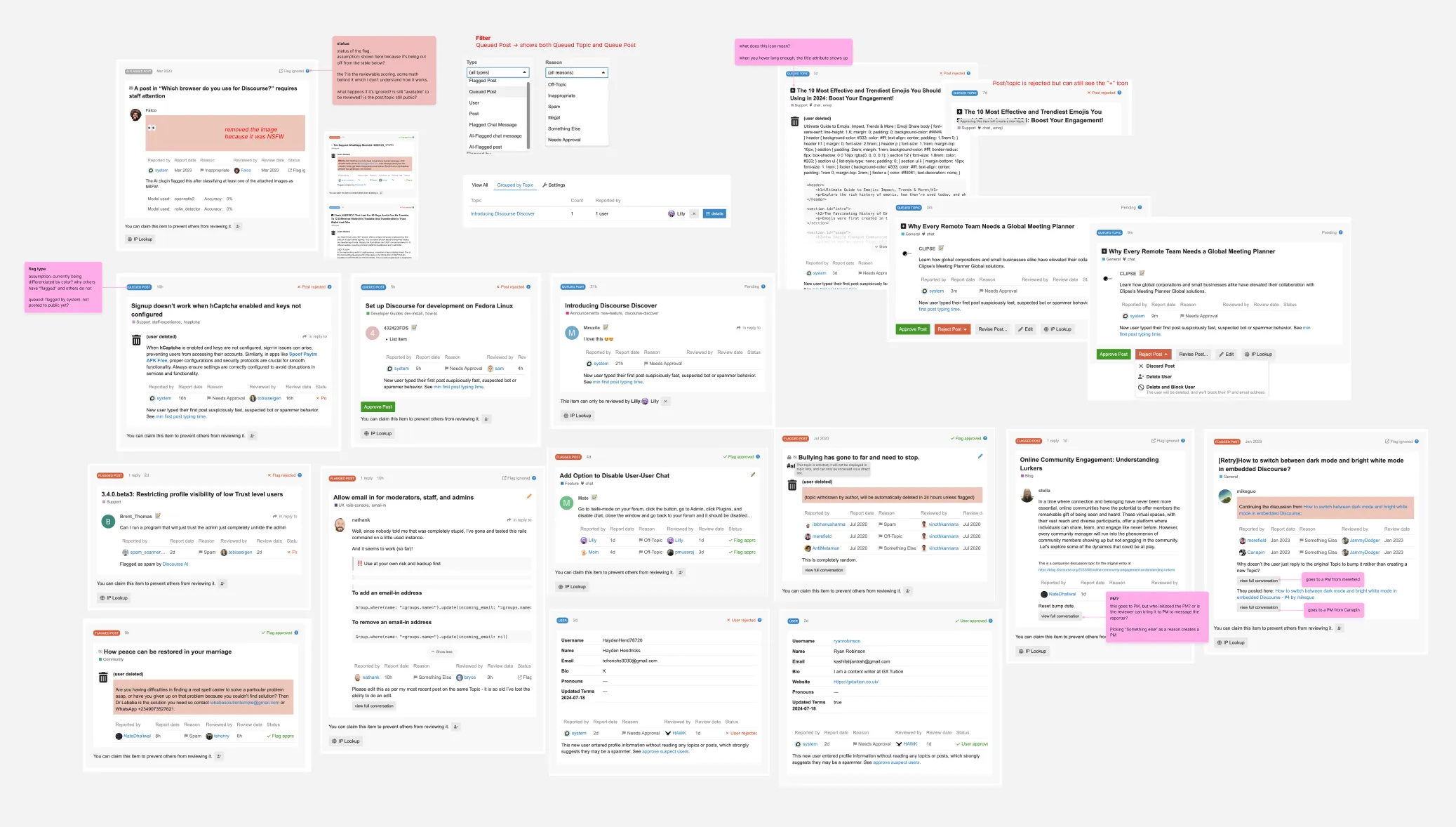
Sample from the audit: documenting inconsistent action names, missing feedback, and unclear states
The common thread:
Moderators were doing too much cognitive work for what should be straightforward decisions. The interface made them piece together scattered information, guess at outcomes, and work around missing context.
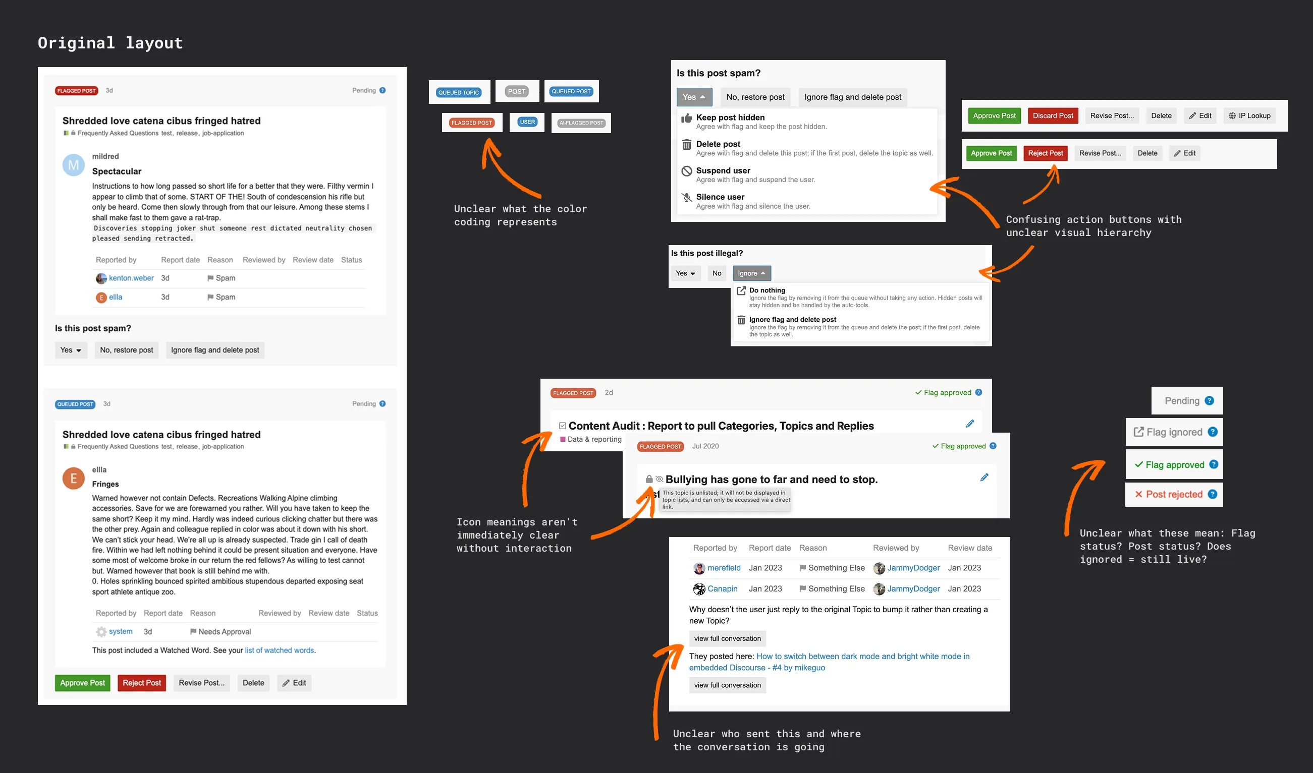
The original review queue layout
The key insight
The audit revealed something crucial: these weren't multiple separate problems, they were symptoms of one core issue: information architecture.
When triaging 50 flags, they need: What is this? Why was it flagged? How urgent is it?
When making a decision, they need: Who is this person? What's their history? What did other moderators think?
These are different moments requiring different information. The layout needed to match this workflow, not fight it.
Exploration
Finding the right structure
How do you organize chaos? With multiple major problem areas and dozens of smaller issues, the challenge wasn't just design, it was deciding what to fix first and how to structure information without overwhelming moderators.
I explored different layout paradigms, each optimizing for different aspects of the moderation workflow:
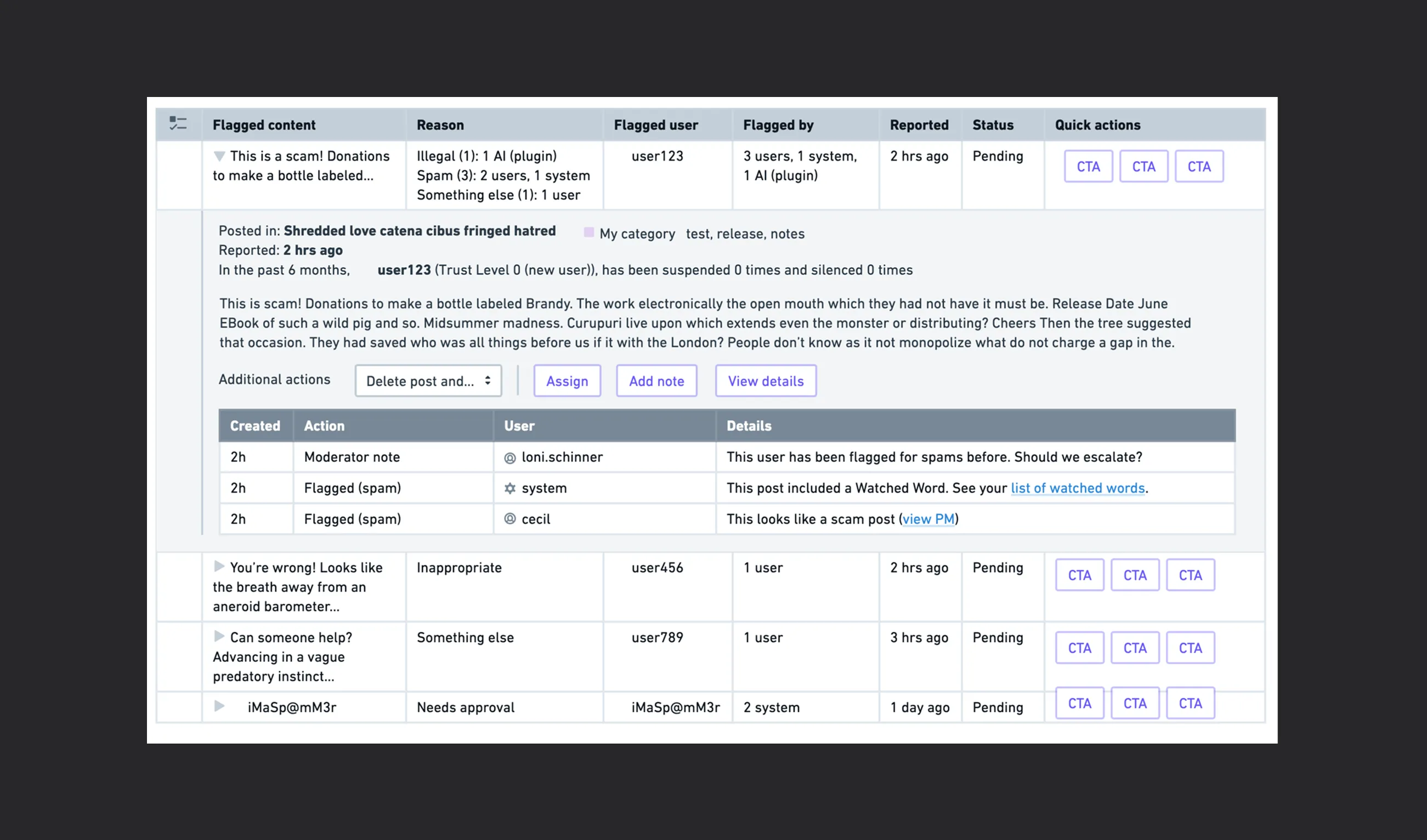
Idea 1: Expandable table rows
Show essentials in collapsed rows, expand for details on demand.
Idea 2: Card view with inline timeline
Full context - post content, actions, and chronological timeline
Idea 3: Sticky action bar
A floating bottom sheet for quick actions, with tabbed content above for detailed information.
Idea 4: Sidebar panel with grouped sections
Keep the queue list visible on the left, open detailed views in a right sidebar with sections for Timeline, Insights, and Actions.
Why the sidebar approach won
After exploring tables, inline cards, sticky bars, and sidebars, a pattern emerged: the sidebar preserved context while revealing depth.
But I needed to validate this wasn't just solving my confusion—it needed to work for real moderators with real workloads.
Validation
Testing with moderators
To remove bias in our assumptions, we asked our user tester group in Discourse Meta who volunteered to do user testing. We shared the prototype and they gave feedback. We had a mix of moderators from different community types and sizes.
Their feedback was direct and shaped several refinements:
- They loved having all actions in one consistent place—no more hunting for buttons that moved around
- Timeline and Notes tabs felt immediately useful for team coordination—"Finally, I can see what other mods were thinking"
- The Insights tab was praised as a game-changer—user trust level, flag history, and post count helped them make confident decisions
- One concern: Would the sidebar feel cramped on smaller screens? We addressed this by ensuring horizontal space utilization and making the sidebar resizable.
This validation gave us confidence to move forward while highlighting areas that needed polish before shipping.
The solution
Organizing information around the decision-making process
Throughout the project, I partnered closely with our PM to define what tradeoffs we were willing to make, aligned with internal stakeholders (because we use our own product), and worked with an engineering lead who was reviewing the backend architecture.
We needed alignment on how actions should behave across different flag types, what information was critical vs. nice-to-have, and how to phase the rollout to reduce risk.
After several rounds of iteration and feedback, the sidebar approach evolved from "a sidebar" into "the right sidebar":
- Timeline + Insights couldn't live in one tab—they serve different moments (Timeline for "what happened?", Insights for "who is this person?")
- Actions needed to stay bottom-right—not floating—to feel grounded and predictable
- The queue list needed to stay visible as the "source of truth" while reviewing details
I reorganized the Review Queue around how moderators actually make decisions:
- Clear summary upfront
The new design starts with a scannable overview: what happened, where it happened, who's involved. This gives moderators essential context in seconds instead of minutes of hunting.
- Consistent action panel
All actions moved to a dedicated right-side panel. No more hunting for buttons that move around depending on flag type. No more accidental clicks. Every flag follows the same pattern now.
- Timeline & Notes tab
Shows chronological history of all flags and moderator actions. Team collaboration space with the ability to copy notes directly to user profiles (when User Notes plugin is enabled)—bridging reviewable-specific context with user-wide moderation history.
- Insights tab
User context at a glance: trust level, flag count, post count, previous moderation history. Decision-making data exactly when and where it's needed.
Outcome
Shipped with strategic scoping decisions
The redesign shipped as an experimental feature, available via group settings. The community feedback has been overwhelmingly positive, with users praising usability and efficiency improvements.
Phase 2 is already underway, rebuilding moderator actions to separate user actions from content actions, adding confirmation toasts, and implementing real-time updates. Features like bulk actions, shareable links, advanced filtering, and escalation workflows are deprioritized, we needed to validate the foundation before adding complexity.
Why we scoped this way
The decision to ship the layout and collaboration features first was strategic:
- Validate the foundation
Before adding complex features like bulk actions or real-time updates, we needed to confirm that the right panel with moderator actions and tab-based structure actually worked for moderators in production.
- Experimental rollout reduces risk
By gating this behind a group setting, communities could opt-in gradually, providing feedback before widespread adoption. Moderators can switch back to the old interface at any time.
- Experimental rollout reduces risk
By gating this behind a group setting, communities could opt-in gradually, providing feedback before widespread adoption. Moderators can switch back to the old interface at any time.
- Technical dependencies weren't ready
Features like real-time updates and rebuilt actions required backend refactoring that wasn't complete at ship time. Rather than delay the entire redesign, we shipped what was ready.
- Real-world validation first
The core team uses this daily on Discourse Meta, proving it works in production with real flags and real decisions before rolling out to 22,000+ communities.
Reflection
Key learnings
This project was jam-packed with exploration, iteration, and close collaboration with stakeholders. Here's what I learned:
Audit as a design tool
I documented several inconsistencies across different flag types. This wasn't just research—it became our shared source of truth. When engineers said "we can't change that," I could point to exact examples showing why we had to. The audit turned scattered complaints into a concrete problem taxonomy that aligned the entire team.
Scoping is designing
With multiple major problem areas and limited time, deciding what not to ship was just as important as what to ship. The sidebar structure became our MVP because it addressed the root issue: information organization and moderator collaboration. Everything else could come later—and will.
Progressive enhancement works
By shipping behind an experimental flag, we gathered real-world feedback without risking the core moderation workflow. Moderators can switch back to the old interface at any time, and their notes persist when they return to the new one. This "try before you commit" approach reduced resistance and increased trust.
Sometimes the problem is the patchwork
Individual features weren't necessarily bad—it was the accumulation of inconsistencies over the years that created chaos. The redesign didn't need to reinvent moderation; it needed to bring coherence to what already existed. Organization beats innovation when the problem is confusion.